ZooScan - Part 2: Project Setup and the First Steps
In the previous post, I introduced the ZooScan app idea and shared a demo of the app in action. In this post, we’ll be getting our hands dirty. We will set up the project, create the basic UI, and implement the first steps of the app. By the way, if you’re looking for an overview of all the posts in this series, you can find them here.
To give you a basic idea of what we’ll be doing, here is an animated GIF that shows the app in action.

As we can see there are four screens we need to implement:
- The initial screen, where no animals have been scanned yet. This screen will show a button to select an animal from the photo library or take a new photo.
- The photo selection or camera screen, a screen that either shows the photo library or the camera, depending on the user’s choice.
- The main screen, where the scanned animals as well as the favorite animals are shown. Both the scanned animals and the favorite animals will be shown in a carousel.
- The detail screen, where the details of a scanned animal are shown, including its name, a larger image, and a button to mark it as a favorite.
In addition to these screens, we will likely also need to implement a ViewModel to manage the state of the app, as well as a
Model to represent the scanned animals. What’s more, we will need to add a machine learning model that can classify the animals
based on the photos taken. These components will be discussed in later posts. Now, we will see how to implement these screens step by step, starting with the project setup.
By the way, if you want to follow along, you can find the source code for this post here.
Project Setup #
Let’s start by creating a new Xcode project. Open Xcode and create a new project. Choose the “App” template under iOS, and name it “ZooScan”.
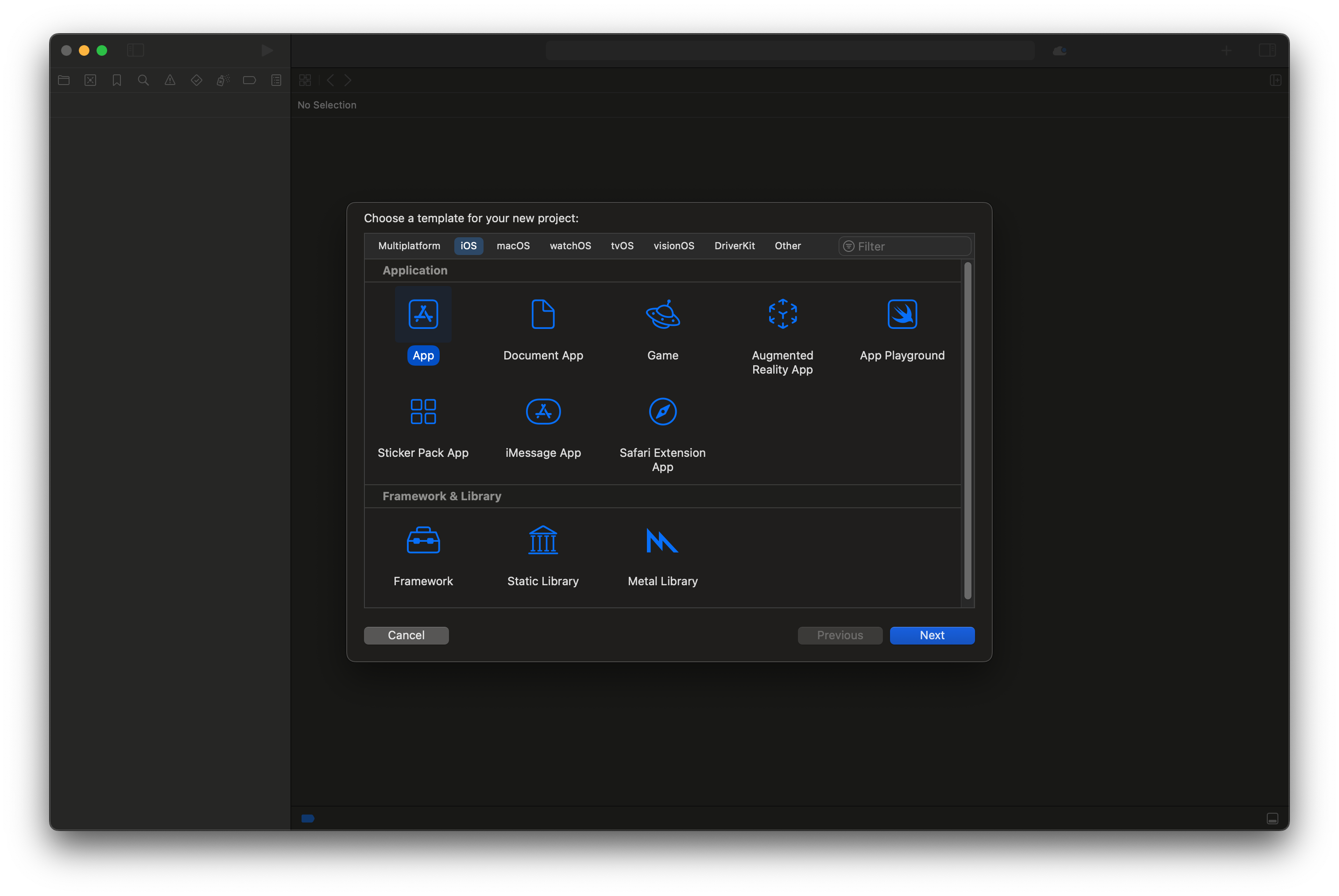
Create an iOS App project
When prompted, make sure to select Swift as the language and SwiftUI as the user interface. Also, ensure that you select a Team and fill out the Organization Identifier. This will allow us later to test the app on a physical device.
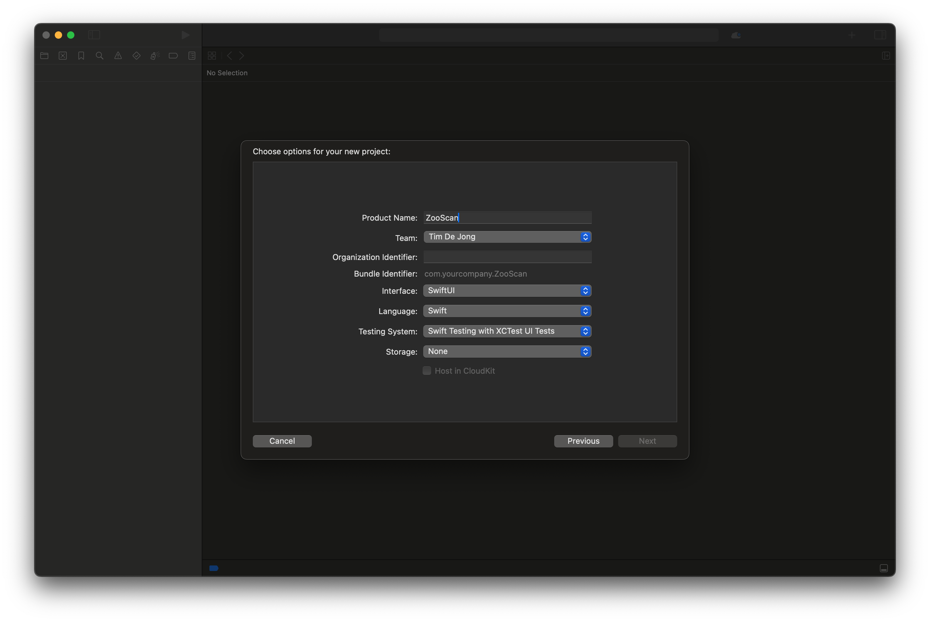
Select the following project options
When the project is created, you should see a Xcode project similar to the one below.
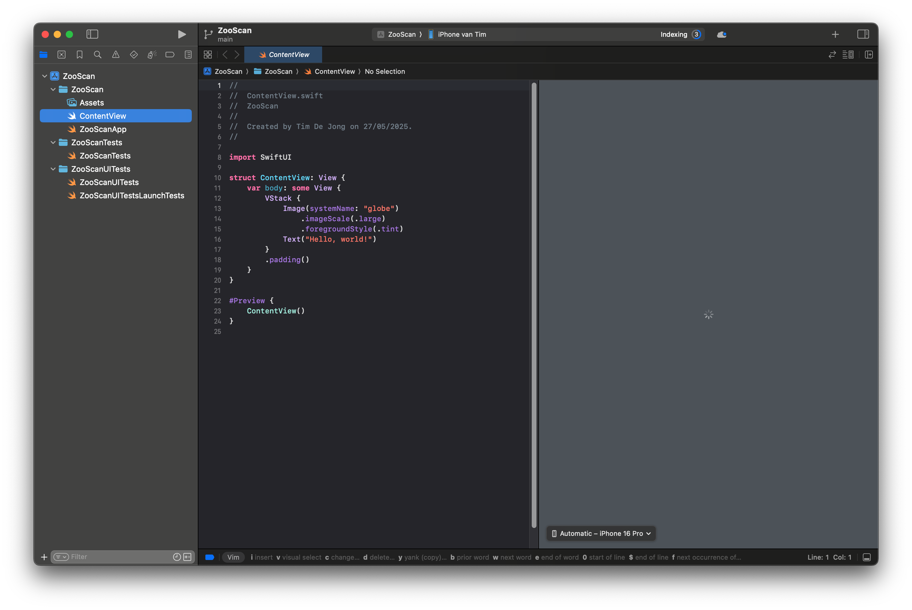
The initial Xcode project
Now that we have our project set up, we can start implementing the screens. We will start with the simplest screen, the initial screen.
The Initial Screen #
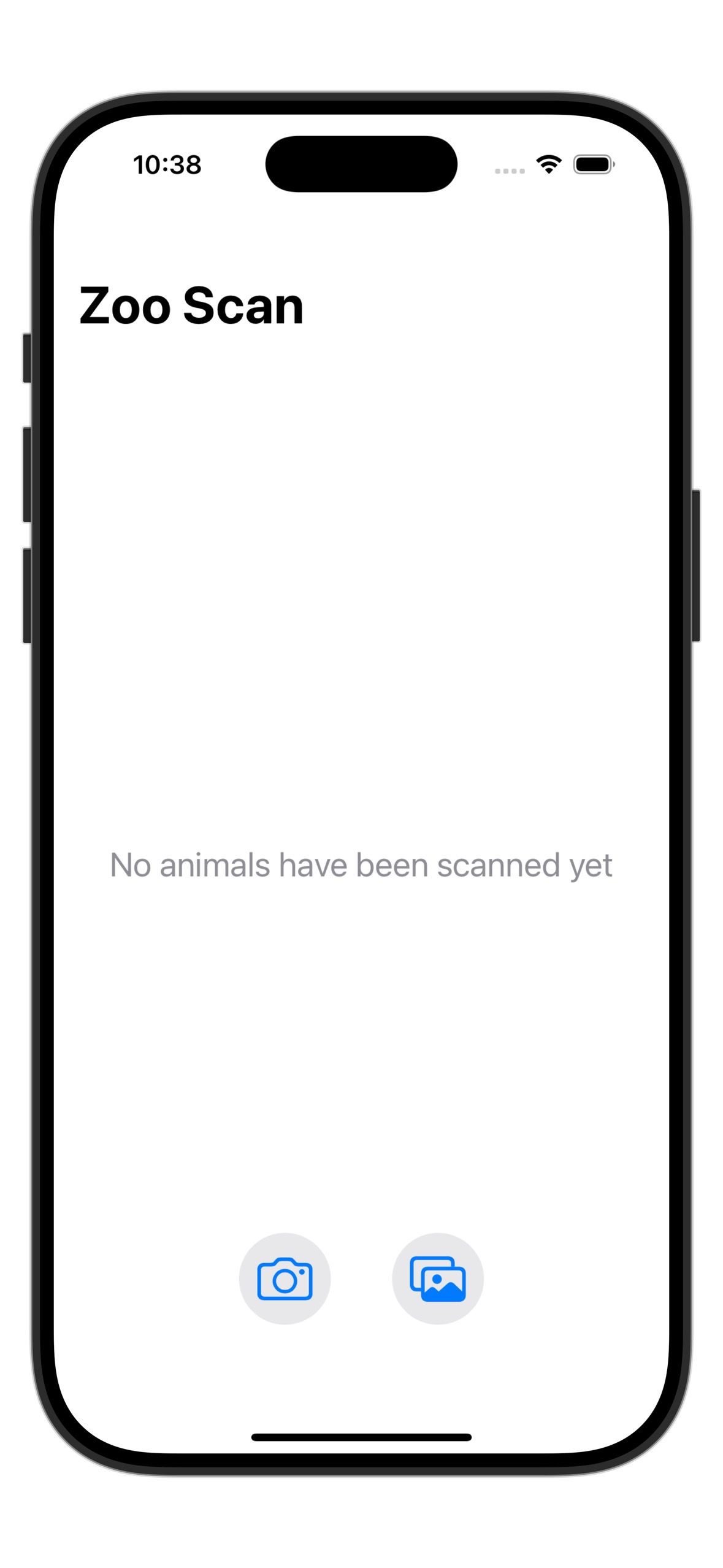
The initial view of the ZooScan app
As seen in the image above, the initial screen shows the title of the app “ZooScan”, a text that says “No animals scanned yet”, and two buttons. One button allows the user to select a photo from the photo library, and the other button allows the user to take a new photo using the camera. To start, add the following Swift code to the body of the ContentView.swift file:
import SwiftUI
import UIKit

struct ContentView: View {

    var body: some View {
        NavigationStack
        {
            VStack
            {
                VStack(spacing: 20) {


                        Spacer()
                        Text("No animals have been scanned yet")
                            .font(.title2)
                            .multilineTextAlignment(.center)
                            .foregroundColor(.gray)

                        Spacer()

                }
                .frame(minHeight: UIScreen.main.bounds.height - 200)
                .frame(maxWidth: .infinity)

                Spacer()

                HStack(spacing: 40) {
                    Button(action: {

                    }) {
                        Image(systemName: "camera")
                            .font(.system(size: 30))
                            .frame(width: 60, height: 60)
                            .background(Color.gray.opacity(0.2))
                            .clipShape(Circle())
                    }

                    Button(action: {

                    }) {
                        Image(systemName: "photo.on.rectangle")
                            .font(.system(size: 30))
                            .frame(width: 60, height: 60)
                            .background(Color.gray.opacity(0.2))
                            .clipShape(Circle())
                    }
                }
                .padding(.bottom, 50)
            }
        }
        .navigationTitle("Zoo Scan")
    }
}
We can see that the root view above, is a NavigationStack. The reason for this is that we want to navigate later to a detail view when an animal is selected. Inside
the NavigationStack we find a VStack that contains another VStack with the text “No animals have been scanned yet” and a HStack containing the two buttons.
The first button has a camera icon, and the second button has a photo library icon. Each of these icons is taken from the standard SF Symbols library. Both buttons
currently do not have any action associated with them, but we will add that in the next section.
The Photo Selection or Camera Screen #
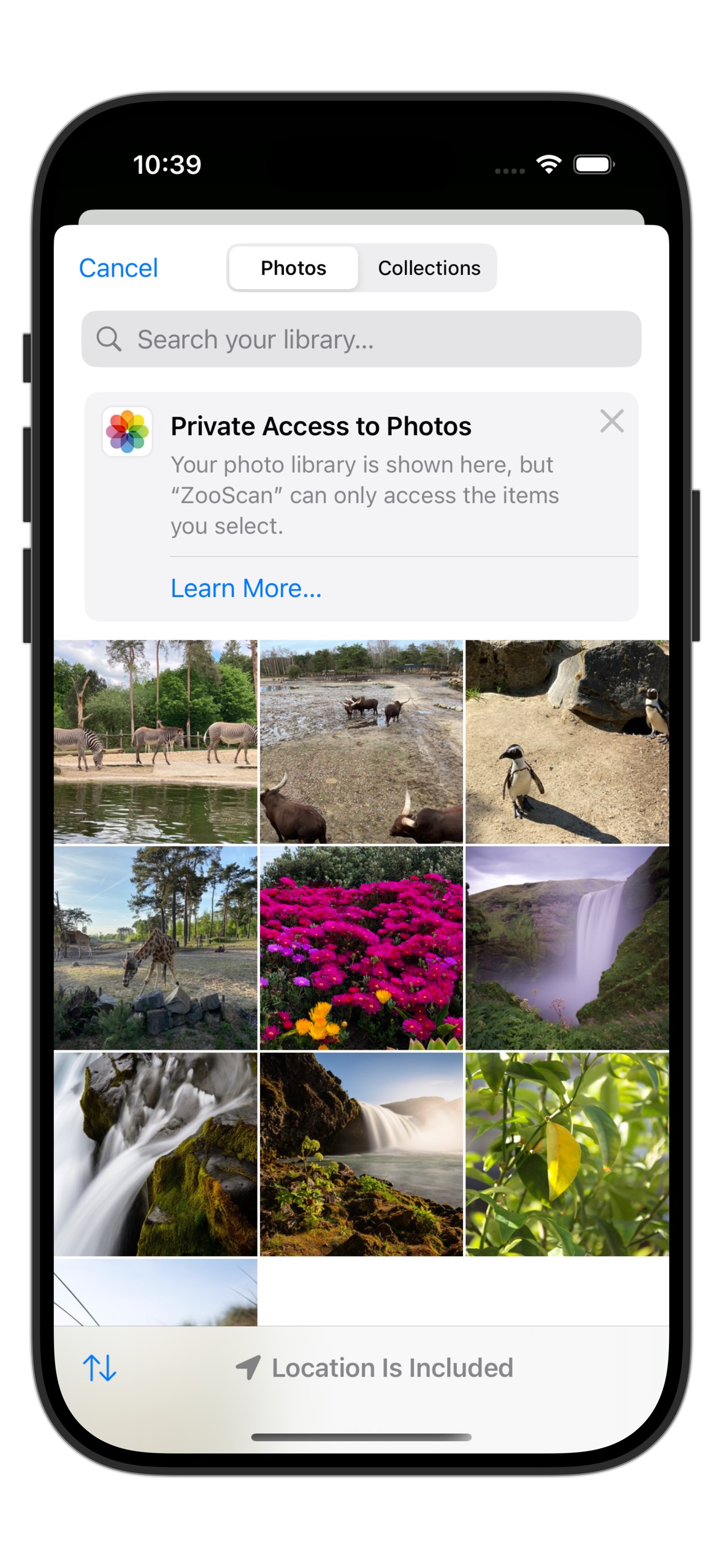
The photo picker view
The next part is to implement the photo selection or camera screen. Create a file called ImagePicker.swift in the project, and copy the following code snippet into it:
import SwiftUI
import UIKit

struct ImagePicker: UIViewControllerRepresentable {
    @Binding var selectedImage: UIImage?
    @Binding var sourceType: UIImagePickerController.SourceType
    @Environment(\.presentationMode) private var presentationMode

    init(selectedImage: Binding<UIImage?>, sourceType: Binding<UIImagePickerController.SourceType> = .constant(.photoLibrary)) {
        self._selectedImage = selectedImage
        self._sourceType = sourceType
    }

    func makeUIViewController(context: Context) -> UIImagePickerController {
        let picker = UIImagePickerController()
        picker.delegate = context.coordinator
        picker.sourceType = sourceType
        return picker
    }

    func updateUIViewController(_ uiViewController: UIImagePickerController, context: Context) {}

    func makeCoordinator() -> Coordinator {
        Coordinator(self)
    }

    class Coordinator: NSObject, UIImagePickerControllerDelegate, UINavigationControllerDelegate {
        let parent: ImagePicker

        init(_ parent: ImagePicker) {
            self.parent = parent
        }

        func imagePickerController(_ picker: UIImagePickerController,
                                 didFinishPickingMediaWithInfo info: [UIImagePickerController.InfoKey : Any]) {
            if let image = info[.originalImage] as? UIImage {
                parent.selectedImage = image
            }

            parent.presentationMode.wrappedValue.dismiss()
        }

        func imagePickerControllerDidCancel(_ picker: UIImagePickerController) {
            parent.presentationMode.wrappedValue.dismiss()
        }
    }
}

#Preview {
    ImagePicker(selectedImage: .constant(nil))
}
The code above defines a so-called UIViewControllerRepresentable. This is a type that can wrap UIKit code and make it available in SwiftUI. In this case, we are wrapping the UIImagePickerController, which is the standard controller for selecting images from the photo library or taking a new photo with the camera. A similar construct is available in
SwiftUI, called PhotosPicker but it only provides access to the photo library, not the camera. Adding camera support in SwiftUI involves us to create our own camera view using
AVFoundation code. This is much more complicated than using the UIImagePickerController to provide both functionalities. As you can see, this can be done in just a few lines of
code.
Let’s break down the code above. We’ll start with the ImagePicker struct, which conforms to the UIViewControllerRepresentable protocol. This protocol allows us to create a UIViewController that can be used in a SwiftUI view hierarchy.
struct ImagePicker: UIViewControllerRepresentable {
    @Binding var selectedImage: UIImage?
    @Binding var sourceType: UIImagePickerController.SourceType
    @Environment(\.presentationMode) private var presentationMode

    init(selectedImage: Binding<UIImage?>, sourceType: Binding<UIImagePickerController.SourceType> = .constant(.photoLibrary)) {
        self._selectedImage = selectedImage
        self._sourceType = sourceType
    }
    ...
}
The struct has two SwiftUI bindings for the selectedImage and the sourceType, respectively. The selectedImage binding is used to store the image that the user selects. The sourceType binding is used to determine whether the user wants to select an image from the photo library or take a new photo with the camera. The struct contains another member
called the presentationMode. The presentationMode environment variable is used to dismiss the image picker when the user is done selecting an image. In addition, we see that
the struct has an initializer for the bindings. The sourceType binding defaults to .photoLibrary, which means that if the user does not specify a source type, the photo library will be used.
Next, we have the makeUIViewController and updateUIViewController methods, which create and update the UIImagePickerController instance:
 func makeUIViewController(context: Context) -> UIImagePickerController {
        let picker = UIImagePickerController()
        picker.delegate = context.coordinator
        picker.sourceType = sourceType
        return picker
    }

func updateUIViewController(_ uiViewController: UIImagePickerController, context: Context) {}
We see that the makeUIViewController method creates a new UIImagePickerController instance, sets its delegate to the Coordinator, and sets the source type to the value of the sourceType binding. Note also that the Coordinator conforms to both UIImagePickerControllerDelegate and UINavigationControllerDelegate. This is a requirement because the UIImagePickerController delegate property defines both these conformances. The updateUIViewController method is empty because we do not need to update the view controller after it has been created.
Finally, we have the makeCoordinator method, which creates a new instance of the Coordinator class:
func makeCoordinator() -> Coordinator {
    Coordinator(self)
}

class Coordinator: NSObject, UIImagePickerControllerDelegate, UINavigationControllerDelegate {
    let parent: ImagePicker

    init(_ parent: ImagePicker) {
        self.parent = parent
    }

    func imagePickerController(_ picker: UIImagePickerController,
                             didFinishPickingMediaWithInfo info: [UIImagePickerController.InfoKey : Any]) {
        if let image = info[.originalImage] as? UIImage {
            parent.selectedImage = image
        }

        parent.presentationMode.wrappedValue.dismiss()
    }

    func imagePickerControllerDidCancel(_ picker: UIImagePickerController) {
        parent.presentationMode.wrappedValue.dismiss()
    }
}
A Coordinator class is used in UIViewControllerRepresentable types to handle the delegate methods of UIKit views and provide the binding glue between SwiftUI and UIKit. Here,
the Coordinator class conforms to the UIImagePickerControllerDelegate and UINavigationControllerDelegate protocols. It has a reference to the parent ImagePicker instance, which allows it to access the bindings and dismiss the picker when the user is done selecting an image. We can see here that it sets the selectedImage when the user selects an image
in imagePickerController(_:didFinishPickingMediaWithInfo:) and it dismisses the picker when the user is done selecting an image or has canceled the selection.
Showing the ImagePicker #
To show the ImagePicker we will need to implement the actions behind the buttons in the initial view. We will add two state variables to the ContentView to keep track of the selected image and the source type. We will also add a state variable to control the presentation of the ImagePicker. One button will open the camera view, the other button will open the photo library view. Start by adding the following code to the ContentView.swift file, at the top of the ContentView struct:
struct ContentView: View {
    @State private var selectedImage: UIImage?
    @State private var isImagePickerShown = false
    @State private var sourceType: UIImagePickerController.SourceType = .photoLibrary
    ...
}
The state variables selectedImage, isImagePickerShown, and sourceType are used to keep track of the selected image, whether the image picker is shown, and the source type of the image picker, respectively.
Next, we will modify the two buttons in the initial view to show the ImagePicker when tapped. Update the button actions in the ContentView.swift file as follows:
HStack(spacing: 40) {
    Button(action: {
        sourceType = .camera
        isImagePickerShown = true
    }) {
        Image(systemName: "camera")
            .font(.system(size: 30))
            .frame(width: 60, height: 60)
            .background(Color.gray.opacity(0.2))
            .clipShape(Circle())
    }

    Button(action: {
        sourceType = .photoLibrary
        isImagePickerShown = true
    }) {
        Image(systemName: "photo.on.rectangle")
            .font(.system(size: 30))
            .frame(width: 60, height: 60)
            .background(Color.gray.opacity(0.2))
            .clipShape(Circle())
    }
}
.padding(.bottom, 50)
We see that both buttons put the isImagePickerShown state variable to true. We will use this later to
show a modal sheet with the ImagePicker view. There’s also a difference, the top button sets the sourceType to .camera, while the bottom button sets it to .photoLibrary. This way, we can control which source type is used when the ImagePicker is presented. Each button therefore shows a different type of ImagePicker view.
Finally, we will add the ImagePicker view to the ContentView and present it as a sheet when isImagePickerShown is true. Add the following code at the end of the ContentView struct:
.sheet(isPresented: $isImagePickerShown) {
    ImagePicker(selectedImage: $selectedImage, sourceType: $sourceType)
        .ignoresSafeArea()
}
If you launch the app now in the simulator, you should see the initial view with the two buttons. Tapping the camera button will open the camera view, and tapping the photo library button will open the photo library view. Cool!
Conclusion #
We have now implemented the initial view and the ImagePicker view. We also coupled the buttons in the initial view to open up the ImagePicker view in the .photoLibrary or the .camera mode. To see the completed code (and a bit more), check out the GitLab repository here.
In the next post, we will implement the Main view displaying the images and the Detail view for each scanned animal. These views need to be integrated with an underlying ViewModel and Model which we will discuss in detail too. In later posts, we will also implement the classification of the images using a machine learning model.
